Principles of user experience design in an online store
User experience, or customer experience, can and even should be designed properly. The less you leave to chance, the greater the chance that you will be able to achieve your goals and that your visitors will be satisfied with interacting with your store.
However, don’t expect that you just need to “tick off” a few points, and your website will always be a model of a well-designed online store. Customers’ needs and expectations change over time, and besides, there is a high probability that the first version of your store will turn out to be far from perfect. So be prepared for the need to iterate regularly.
There are many user experience design principles to follow. While a large part of them are universal, not all of them will be applicable to every online store. As always – it’s up to you to decide which ones to focus on right away, and which ones can wait.
First: the user first
It’s a very general rule, and one that seems obvious, but if that were actually the case, we wouldn’t need to be reminded of it. The whole rule can be summarized in one sentence: the user experience must be built around the user’s needs, problems and preferences.
In order to actually, and not just on paper, put the customer first, you need to make sure that you know the customer’s most relevant problems. Only by doing so will you be able to propose specific solutions and design your online store to support these activities.
In this case, it’s not just about designing the layout of the store’s website or the view of payment methods – although these are obviously important points. User experience planning begins as soon as you choose what products or services you will sell in your store.
What can you do if you already run an online store and want to improve the customer experience? Get information from them about what they expect. Ask directly, if you have the option, or create a survey. You can ask in detail about various aspects of the store’s operation, or even about specific elements, such as the layout of the site, the breakdown of product categories, the availability of payment methods, and so on. A well-constructed survey, combined with a little customer goodwill (you can try to influence it with various incentives), will give you a lot of information that you can use when implementing changes.
Second: UX simplicity is key
It’s easy to be tempted to include too many interesting elements on a store page. Visit a few large shopping portals, and you’re bound to notice sites with too much “going on.” Leaving aside ads, pop-ups and other annoying elements, even the basic visual layer of stores is often in chaos.
Take care not to clutter the space where customers will navigate. Before you add another button, recommended product or information box, try to look at this action from the customer’s perspective. Will this element make it easier for him to find his way around your store? Will it make him more confused?
Third: a good first impression in e-commerce
It is often said that the first impression is the most important. In the case of online stores, this is much more than a saying. A customer will decide whether your site interests him or her within a few seconds at most of visiting it (some sources, such as ConversionXL, report – citing Google research – that it only takes half a second for a user to know whether he or she likes a site).
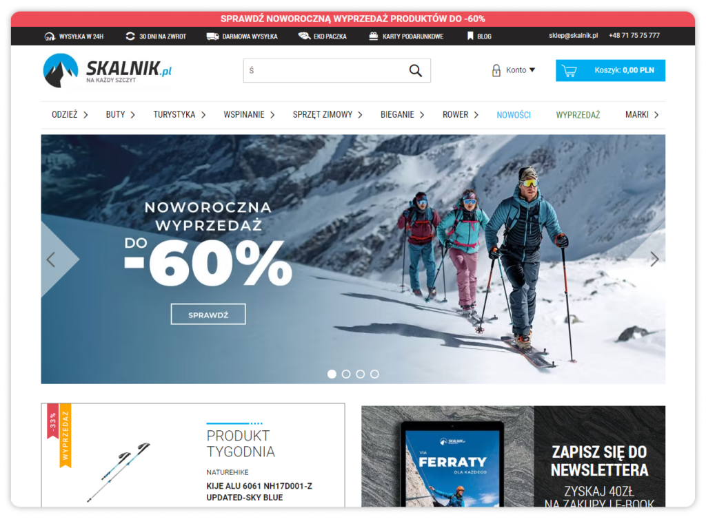
The whole thing is made a little more difficult by the fact that for several years now, websites have been greeting us with frequent pop-up prompts informing us of the use of cookies, and as soon as we manage to close that window, the view is obscured by pop-ups. However, while the latter can be dispensed with by online store owners (or configured to run later without ruining the first impression), nothing can be done about cookies – the first visit to a store’s website will always be “polluted” with them, which makes it very difficult to take care of a good user experience in the first moments of interacting with the store.
So what should be in the foreground? Simple and clear navigation, an aesthetically pleasing store logo (even if the customer leaves the site, a good logo will help him remember the name of the store), a promotional banner or a featured product. Of course, you don’t have to put all of the listed elements at the top of the page. Decide for yourself which ones are key.
To increase the chances that a customer will decide to stay on the site, emphasize what is most important. Highlight the elements that will allow him or her to move on: push the transaction forward (important if the customer comes to the site from an ad in an external source or from a landing page) or draw the customer’s attention to an ongoing promotion.
And don’t forget about the content – a good headline can attract attention just as well as the layout of the page.
Above the fold
Above the fold means exactly the line above the fold. In practice, it refers to those elements of a website that users see in their entirety without having to scroll down. It is this part of the page that is absolutely most important in terms of keeping the audience’s attention.
Carefully plan the section above the fold and think about what items need to be in it. If you are running a seasonal sale or want to advertise a new product line, you can undoubtedly promote it in this area. However, avoid adding over-the-top elements. A customer service contact, an inspiration zone, a tutorial, or a list of product categories are things that are better placed below. Interested customers will look for them anyway, and those who have just arrived at the site will not be unnecessarily distracted by them.
Fourth: simple store navigation will increase conversions
Pay special attention to navigation. It must be a menu that is visible from anywhere on the site, which will allow customers to navigate efficiently and quickly. The main navigation in the crushing majority of cases is located at the very top of the page. This solution is as effective as possible, because it makes it easy for the customer to go to the section of interest at any time.
A separate issue is what should be included in such navigation. The hackneyed principle of less is more is partially applicable here – after all, we don’t want to litter the navigation with dozens of links to sub-pages that are not much needed. In an online store, the navigation usually includes the main categories, a search window, a link to log in and a shopping cart icon with a preview of the amount and number of products. In addition to these almost inviolable elements, we can often come across information about an important promotion – as on the empik.com homepage.

The navigation on the Empik website is not ideal – we have a very large number of elements of various sizes here, including links to other Empik sites. What draws special attention, however, is the central location of the search window. Immediately upon entering the site, the user knows where to search for products of interest, which is a very good solution.
The example of the Decathlon store website shows that classic, simple navigation can also work perfectly. At the very top you will find a topbar with information about the ongoing sale, below it a search engine and icons that allow you to go to personalized tabs for customers, and at the very bottom of the navigation the most important categories, some of which are highlighted in color.

The categories you see in the example above are, of course, drop-down. This way, interested customers can check out all the subcategories by moving the cursor over them, but they do not take up unnecessary space on the main page.
Fifth: facilitated search will help increase sales
There’s a reason why the search engine window often appears in the most prominent place on a store’s website and takes up the most space. Customers often come to the site already having in the back of their minds the specific products they are looking for. In this situation, they will ignore a large part of the site, concentrating on being able to search for the item they are interested in. User experience during search is therefore particularly important.
How to improve the search engine experience? It is necessary to implement automatic suggestions that will save customers’ time and also suggest products whose names are difficult to remember.
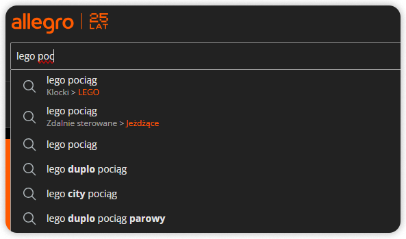
This way, instead of typing the full name of the product, the customer can quickly select what he is interested in after just entering a few characters.
Another element that makes searching easier is filters. When searching stores with a wide assortment of products, customers expect especially precise filters – especially when they buy electronics or other products that often differ in minor parameters. Laptops are a case in point. The possibilities for configuring portable computers are almost limitless, so your store must be ready for the fact that a customer may want to buy a laptop from a particular manufacturer, with a screen diagonal in the desired range and with RAM of no less than 32 GB. A view like the one below is not unusual when a customer is looking for the right product:
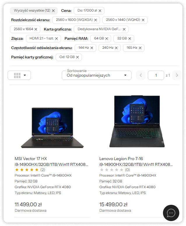
If your store doesn’t offer sufficiently detailed (and corresponding to reality) filters, it will simply lose customers.
Sixth: shopping cart to be optimized
You have certainly heard of the term abandoned shopping cart. This is a situation in which customers – even though they have placed products in their shopping cart – never complete their purchase and leave the site. We wrote more about this phenomenon in our article.
Why do we mention it? The shopping cart is a special place – the place where customers make their final purchase decision. And while there can be dozens of reasons for shopping cart abandonment, a bad user experience is one of them.
A properly built shopping cart view must present a clear and readable summary of purchases. It should include:
- prices of individual products,
- VAT rate,
- Information on possible discounts,
- space to enter the discount code,
- The possibility of changing the number of products ordered,
- The ability to remove a product from the cart,
- The possibility to move the product to the wish list,
- total value of the contract,
- available payment methods (for example, in the form of icons),
- product availability information,
- shipping cost information,
- Information on the amount missing, if any, to obtain free shipping,
- CTAs leading up to the purchase completion stage.
While it seems that there are a lot of these elements, in practice, most turn out to be necessary to provide customers with key information for order fulfillment.
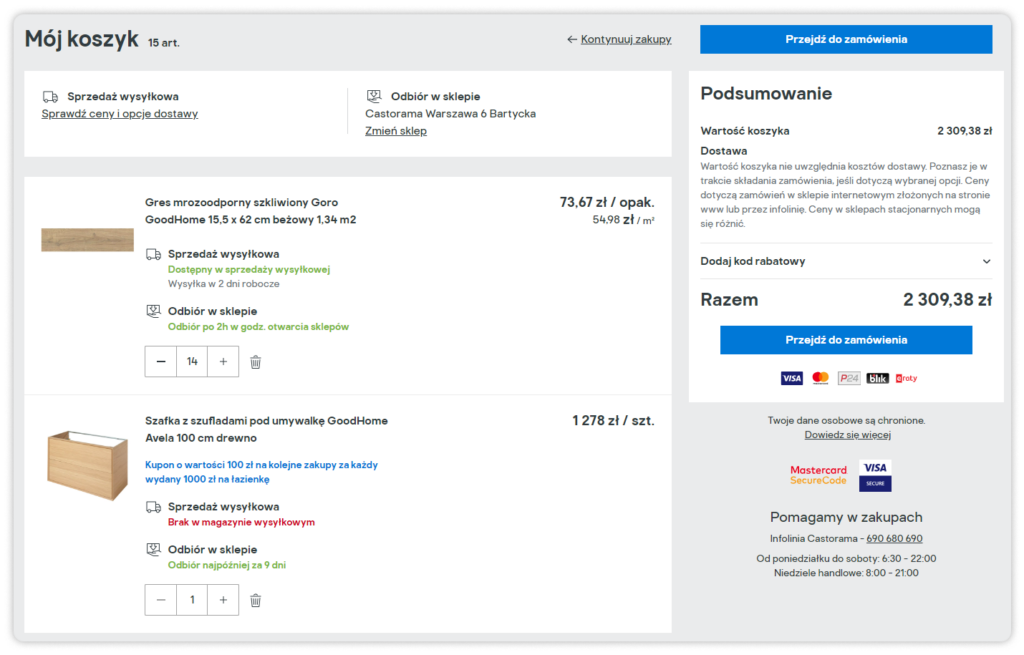
The call to action is particularly important. The button that will take customers to the final step of the transaction should be clear and distinguishable from the other elements. But most importantly – except in exceptionally well-motivated cases – it should be the only button visible in the shopping cart. There is no more room for suggesting other products, informing about contests or the possibility of signing up for a loyalty program. All these elements can appear earlier or later (for example, on the order confirmation screen), but they must not distract the customer at the moment when he or she is making a purchase decision.
Seventh: checkout, or the final of the transaction
The view that a customer will see after clicking on the “To Checkout” (or similar) button in the shopping cart is the checkout, or ordering stage. In recent years, it has become popular to present all the information at this stage on one screen, instead of dividing it into several steps. From the customer’s perspective, this is one of the best, if not the best solution.
At this stage, the user probably already knows what he is ordering and how much he will pay for it. That leaves him to choose a payment method and finalize the purchase. In case this is not the first time he is shopping in a particular store, he will probably spend no more than a few seconds on the summary screen – he will choose his favorite payment method and click “Buy now.”
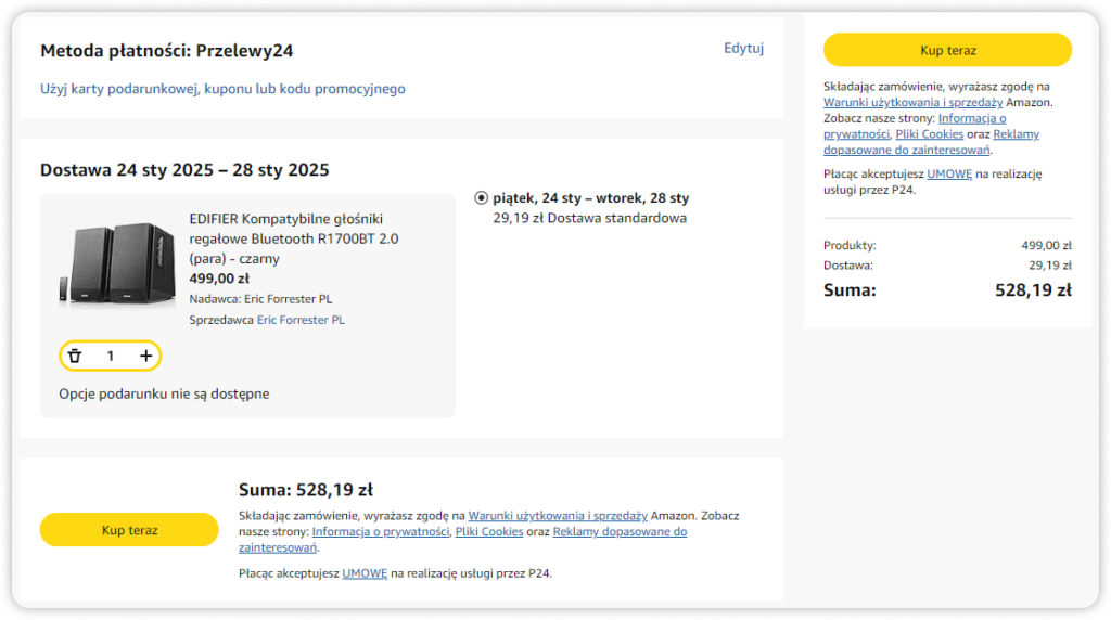
However, this does not mean that splitting the finalization of a transaction is always a bad idea. In the example above, you can see that trying to fit a lot of information on one screen resulted in some information noise – and it’s worth noting that the screenshot shown shows an order with only one product.
Eighth: register or shop as a guest
It’s up to you to decide whether users will be able to shop in your store as guests or whether they will have to create a customer account first. Each of these solutions has its advantages and disadvantages, but from a retention standpoint, getting customers to take a moment and create an account is certainly better.
On the other hand, customers often make one-time purchases – and they know it. This is especially evident during the holiday season, when gifts are bought. We then visit the websites of stores that we probably didn’t know about until a while before. Having to create an account just to make a single purchase can be annoying and lead the user to look for alternatives.
So it’s worth giving the option to buy without registering, while encouraging people to sign up for an account, such as offering a discount on purchases, joining a loyalty program or free delivery.
From the point of view of user experience in an online store, it is a good idea to put all three options on the right screen, so:
- Login form (for returning customers),
- button leading to registration,
- A button that allows you to make a purchase as a guest.

By doing so, you will leave customers with a choice and show that you care about every customer – including those who visit your store for just a moment.
Ninth: don’t forget the mobile version
This is another of the obvious tips. However, the potential of shopping on mobile devices cannot be overstated these days. Currently, the majority of online traffic comes from smartphones (58.21%). Although this source has seen a slight decline (mobile devices accounted for just over 60% of traffic in 2022), it has established itself as the leader and there is no indication of a change to come.
Your online store needs to display well on mobile devices – to make it as easy as possible for users to make purchases when they are away from home.
And if your store is recording good results and you can boast a large base of returning, loyal customers – consider developing your own mobile app. However, this is a costly and time-consuming undertaking, so you should think carefully about the decision to produce an app.
Tenth: test and optimize
UX changes are meant to serve customers, so it’s a good idea – once you’ve made them – to ask regular users if they’re satisfied with the new version of your store. Gather their comments and consider what you can improve to make it even easier for customers to place orders, but also to simply navigate your store.
Analyze the effectiveness of your website and make changes on the fly – for example, using A/B tests, which will give you a clear comparison of the situation before and after the changes.
Summary – UX in an online store
There are certainly more good practices for user experience in an online store. However, these ten points will get you off to a good start, paying attention to the most relevant aspects to ensure your store’s users have a better experience than before.
As long as you keep Rule One in mind when making changes: the user should always come first, your UX work should yield positive results. Good luck!


