Button, link or something else, that is, what does a CTA look like?
The most basic face of call to action is a button under which a link is placed. Another option, also frequently used, is a hyperlink subsumed under plain text. The last option is plain text, which encourages you to take action, but is not sub-linked. However, this last case is very specific – as there is no way to verify its effectiveness. In this respect, links are much more authoritative, because you can easily measure the conversion rate in them and see how effective they are.
Add to cart, or types of call to action in marketing
Głównym celem call to action jest nakłonienie odbiorców do wykonania akcji. Akcje te jednak mogą być bardzo różne, w zależności od Twojej intencji. Jakie więc cele możesz zrealizować z wykorzystaniem CTA? Oto przykłady!
- Generating leads
- Increasing the reach of content
- Increasing commitment
- Sales
Generating leads
Creating a CTA that supports lead generation in its premise is uncomplicated – all you need to do is determine exactly what action the visitor should take, and then write a CTA that clearly describes what will happen after the click.
If you want a visitor to become a lead, you can create a form, the completion of which entitles the visitor to download free materials (such as an ebook). The CTA, placed at the end of such a form, can be simply “Download a free ebook” or “Get access to an ebook.”
At first glance, the two calls to action are quite similar, but the first one explicitly says that when the button is clicked, the download will occur. So if you don’t actually intend to give access to the file right away, but want to get confirmation of the email address first, you may mislead visitors this way. In this situation, the latter would be better. The slogan “Get access to the ebook” suggests that something else will have to be done in order for the free material to be given to the person who decides to press the CTA button.
You can also generate leads by creating an industry newsletter. Then, if sending a form is to be equivalent to signing up for a mailing list, it’s best to keep the CTA content as short as possible. An example?
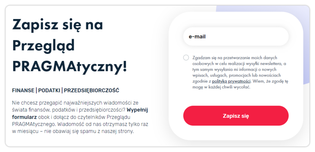
The space for outlining the situation and the purpose of the bequest was on the left side of the section. The form itself, in turn, is the shortest possible, which significantly increases the likelihood of signing up. No personal information, address or PESEL number is needed to send the newsletter – just an email address, consent to communication and a simple, specific CTA. And there you have it!
Increasing the reach of content
Under this term, it will usually involve encouraging users to share your content. Want to get the word out about a promotion or event you’re organizing? Ask your social media followers or newsletter readers. Every share can be worth its weight in gold. Also remember to make the process as easy as possible for your visitors. A popular solution is to include a text-based CTA (“Share the good!”, “Share”, “Pass it on”), with links underneath for one-click sharing on the social platform of your choice (Facebook, Instagram, TikTok, X, but also email).
Increasing commitment
This is a particularly popular way of formulating content on social media. Creators on the Internet want their communities to react vividly to the content they share. So there is no shortage of calls to action in posts, such as: “Share your opinion!”. However, it is often important to retain the user not only on social media, but also on the store’s website or on the blog created by the brand.
The flagship example of a call to action encountered in such situations is “Learn more,” often translated as “Learn more.” Although dated by now (who among us hasn’t encountered this phrase hundreds, if not thousands of times?), it still works and is still used in situations where we include an introduction or a piece of content and want to encourage users to read the whole thing. However, if you feel that “Learn more” is not enough, don’t limit yourself!
A popular direction is to create call to actions that relate in content to what you are writing about or what you want to convey. A music store might encourage people to go to the site with the text “Discover new sounds,” while a holiday season lending company will target users with a message that reads “Go on your dream trip.” A call to action – while worth basing it on certain principles – can be an interesting field for experimenting with content and design.
Sales
The ultimate goal of a call to action is often to make a sale. A compelling call to action is needed at almost every stage of the sales process. The iconic “Add to cart” is still effective – mainly because it is characterized by simplicity and concreteness. “Buy now,” “Place order,” “Start subscription.” – are some equally standard examples. And while they may seem overly simple, these are the CTAs that work best. Why? Because in the final stages of the sales process, your customers need specifics. They want to know that clicking a particular button will take them to payment or send them an order form.
However, this doesn’t mean that there is a lack of room for interesting CTAs when selling. Remember that the call to action is not just the content on the button itself, but also everything that happens around it – as in the example:
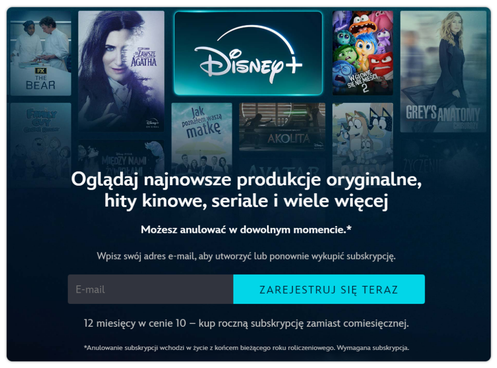
While we can speak of content overload in the above example, one should appreciate not only the consistent color scheme, but also the information about the discount applicable to the purchase of an annual subscription. The attractiveness of the CTA is supported by graphics depicting the hottest titles available in the proposed service, but there are also problems. The information about cancellation at any time is accompanied by an asterisk and a note in the so-called “small print,” which does not inspire confidence in the potential subscriber.
Closing the sale, on the other hand, is where only the concrete matters. The call to action used at the Media Expert store serves as a perfect example:
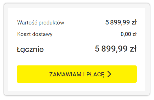
The short, clear content informs the consumer that clicking the button is equivalent to placing an order and the obligation to pay. The color scheme is not only distinctive, but also clearly distinguishes the button from the background, so there is no doubt where to click to finalize the order.
Click here, that is, where can you apply a CTA?
The call to action should appear where it makes sense for the customer to perform the action, which is… almost everywhere. Here are some typical examples of places where you should take care to place a tailored CTA.
In the body of the e-mail message
If you’re writing emails to your customers or potential customers, make sure you make it as easy as possible for them to get in touch with your company. Much depends on the purpose for which you are sending the email in question. The CTA should help you achieve the main goal of the message you are sending. This could be to take them to a landing page (for example, with a contest), to take them to a course enrollment form, but also to place a pre-order or share information about an upcoming event.
In blog texts
Do you run an industry blog? Don’t hesitate to leave a link to your products, similar texts or recommended materials in the body of the article. Don’t overdo the number of buttons, but you don’t have to limit yourself to one either – especially in longer texts.
Keep in mind, however, that placing CTAs in the middle of the text will distract readers and can (and should) make them leave the subpage with the text. While this can be very beneficial, it is worth keeping in mind. On the other hand, placing a CTA at the very end of an article, especially a long one, will likely end up reaching a small percentage of readers.
On the websites
Your company’s website is its business card and can serve a role similar to traditional business cards, namely to make it easier for visitors to contact you. However, having a business card that is much more elaborate than a piece of paper with space for a dozen words or so, you can take advantage of a much wider range of possibilities.
Put a button on the page that leads to your store, a newsletter sign-up form (topped with a suitably prominent button), or perhaps a link that leads to another subpage – these are all calls to action that will help you increase conversions on your website and increase the amount of time a visitor spends with your company.
In the online store
The well-known “Add to cart” is nothing more than the most popular CTA on the Internet. However, you don’t have to limit yourself to this simple and established formula. Many stores are experimenting with CTA content – you can try it too.
“Place order,” “Proceed to payment,” “Reserve product” – these are just a few of the hundreds of phrases you can use on an action button.
On social media
While many social media platforms have severely limited text editing or button creation capabilities, that doesn’t mean you can’t post CTAs on them. Facebook is not fond of links in the content of posts, but no longer has such a problem with links posted in comments. On Instagram, you can put a call to action button in testimonials and reels. Each platform allows you to link to external sites – of course, you’re especially keen if you do it through paid advertising.
How to create an effective CTA? Best practices
It’s time to answer the most important question – how to create a CTA that will convince visitors to perform the intended action? Among the numerous guides that have already been written on this topic, there are many principles that run through, from which we have selected five of the most important.
CTA must be visible
Whether it’s a button on the home page or at the end of an email, the call to action should be the most important element visible on the screen. So the button must be large enough, and the surrounding content must not “hide” and overwhelm it.
If the CTA is on the home page, it should be visible immediately, without having to scroll the page. The same will be true for the form – it should be concise enough for the CTA to be visible immediately. If you are writing a longer email, explain the most important points first, then put the CTA, and only then the rest of the content (possibly repeat the CTA at the end). Don’t let the key element of the message disappear under a wall of text.
Take care, too, in this connection, of the right design – a color scheme that contrasts with the background of the page, a clear and legible font, a text size larger than the standard.
The content should be short
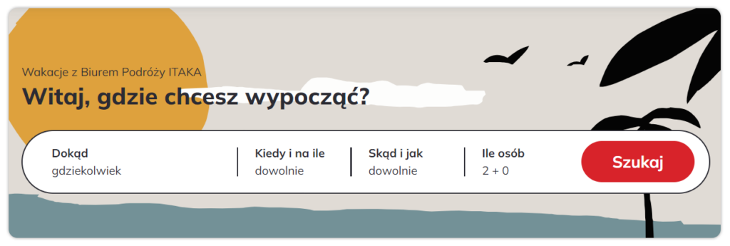
This rule applies to both the content surrounding the button itself and the text visible directly on the button. The ideal length of the content on the button is 1-4 not-too-long words – this should be enough to perfectly describe the button’s operation, and at the same time encourage users to interact. Of course, there are longer, yet effective CTAs, but they are rare – mainly because longer call-to-action content softens the message.
Use action words and the imperative mode
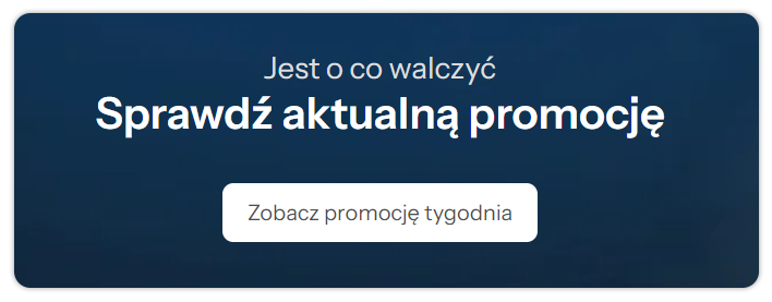
Although the name “command mode” is not necessarily encouraging, these are the most effective calls to action. “Discover,” “Buy,” “Check.” – are all short, soldierly messages that are best at arousing the desire to act.
Instill a sense of urgency
There is no point in deluding yourself into thinking that someone who visits your website is 100 percent focused on it. In all likelihood, he has 40 other tabs open in his browser, and if you don’t grab his attention quickly and effectively, he will shift his attention to one of them in no time.
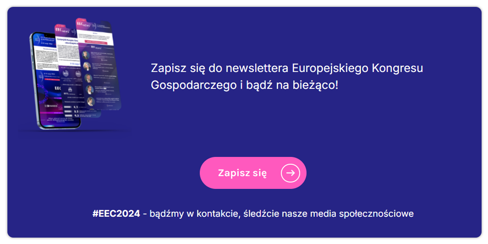
How can you do this? For example, by indicating that your offer is limited in time or quantity – provided that it actually is. Maybe the promotion only lasts until a certain time, or maybe the number of seats for the webinar is limited? Emphasize this and make sure the user thinks twice before leaving your site. Remember, however, that trying to create a sense of urgency for an offer that is not actually limited in quantity or time is deliberately misleading the customer – and that is illegal.
Show benefits
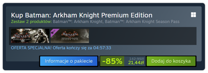
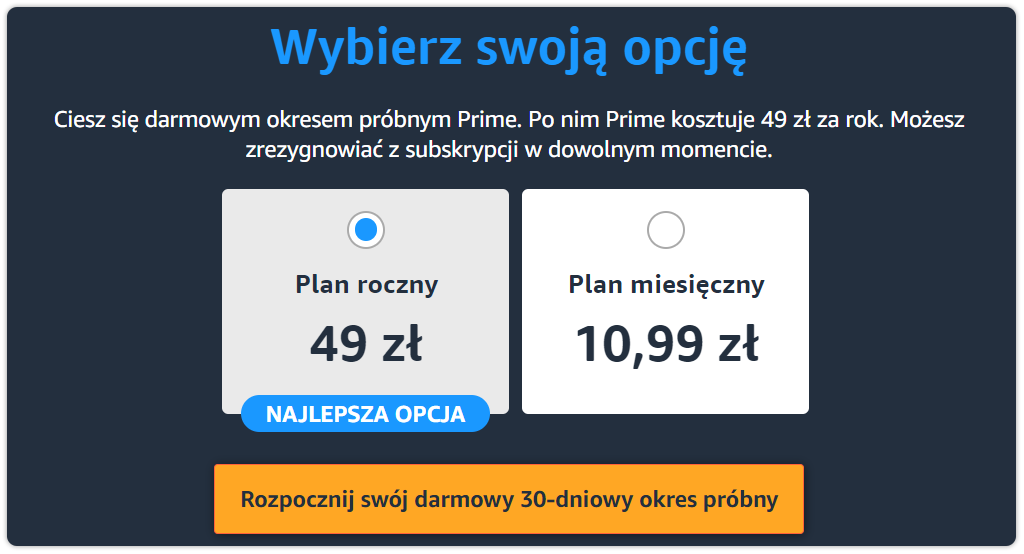
Make sure that even before the user clicks on the CTA, he or she will know why he or she is doing it and what benefit he or she will get from performing the action. The clearer the call to action, the greater the chance that the visitor will do what you expect him to do – and after performing the action, he will be satisfied, not disappointed that you misled him. So the message needs to be clear, and it needs to highlight a specific benefit – as in the example below:
Ensure the effectiveness of the call to action
A call to action is a small but crucial slice of many online communications. When creating a call to action, always follow principles that will make it easily digestible, short, clear, highly visible, and by all means, effective. Also, don’t hesitate to implement A/B testing. Many CTAs can be easily improved, for example, by changing the color, gently modifying the content or where they are located. With A/B testing, you can verify which variant will prove more effective without much risk.


